Coca-ColA Jp
The purpose of the artwork produced for this project was to showcase the potential of whitelabeling and utilizing the money-saving app (Scan & Save) across various applications of Coca-Cola Japan. A live demonstration was conducted for the marketing team at Coca-Cola JP, where my artwork was prominently featured to illustrate the functionality of the app. The design of all the artwork was carefully tailored to resonate with Coca-Cola JP's target audience, ensuring that the solution was brought to life in a culturally familiar manner.
GRAPHIC DESIGN CASE STUDY: Jan 2023
Brand RESEARCH
To gain a thorough understanding of their challenges, possibilities, and target market, we embarked on an extensive exploration of Coca-Cola Japan and its cultural background. My responsibility was to locate research materials that aligned with the given research criteria. Subsequently, I compiled all the relevant findings onto a PowerPoint presentation, prioritizing informative notes, and pertinent links rather than the presentation itself.
App demonstration
The Coca-Cola JP marketing team was shown a demonstration of how the app would function and the user journey through a screen recording by the managing director. The app consisted of all the artwork I had created, with the intention of bringing the solution to life in a culturally recognizable manner. By utilizing the research I had conducted earlier and experimenting through trial and error, I was able to produce artwork that met the requirements and was utilized to highlight the potential of whitelabeling.
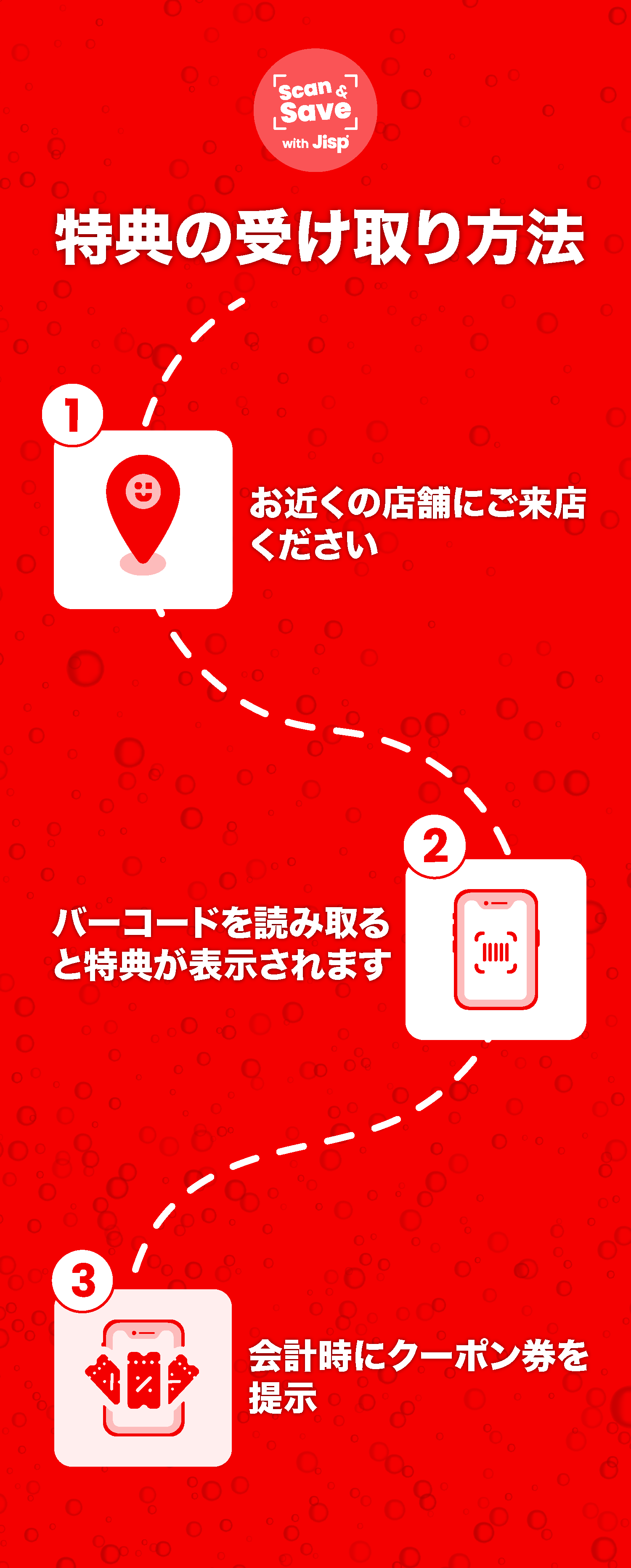
IN APP BANNERS
The reason for having two sets of in-app artwork is as follows. The first set was utilized to illustrate how tapping on an advertisement showcases the promotion of a particular product within the app. On the other hand, the second set is used to demonstrate how the homescreen advertisement can raise awareness about ongoing campaigns such as competitions e.g. a lunar new year competition.


Alternative in app artwork
The alternative artwork showcased below was used within the app to illustrate the user's journey and effectively guide them on the subsequent steps to receive a discount or provide instructions on participating in a competition to win a prize. Additionally, the other artwork represents an email that a user would receive after making a purchase with the app's discount.