Ants Netball Club
Rebrand: December 2024 - Jan 2025 (personal project)
With the introduction of the Netball Superleague 2.0 in the UK, netball enthusiasts nationwide have been gradually introduced to the league's refreshed visual identity, coinciding with an increase in social media activity from the clubs. This rebranding initiative, aimed at enhancing the visibility of our sport, prompted me to reflect on my club's visual identity. I considered how our current branding and social media presence compare to those of rival clubs at local, national, and international levels. Given that netball is my passion outside of a professional context, I decided to dedicate my free time to evaluating my club's shortcomings and, consequently, modernizing its branding in line with contemporary netball design trends.
Current Design Trends Research
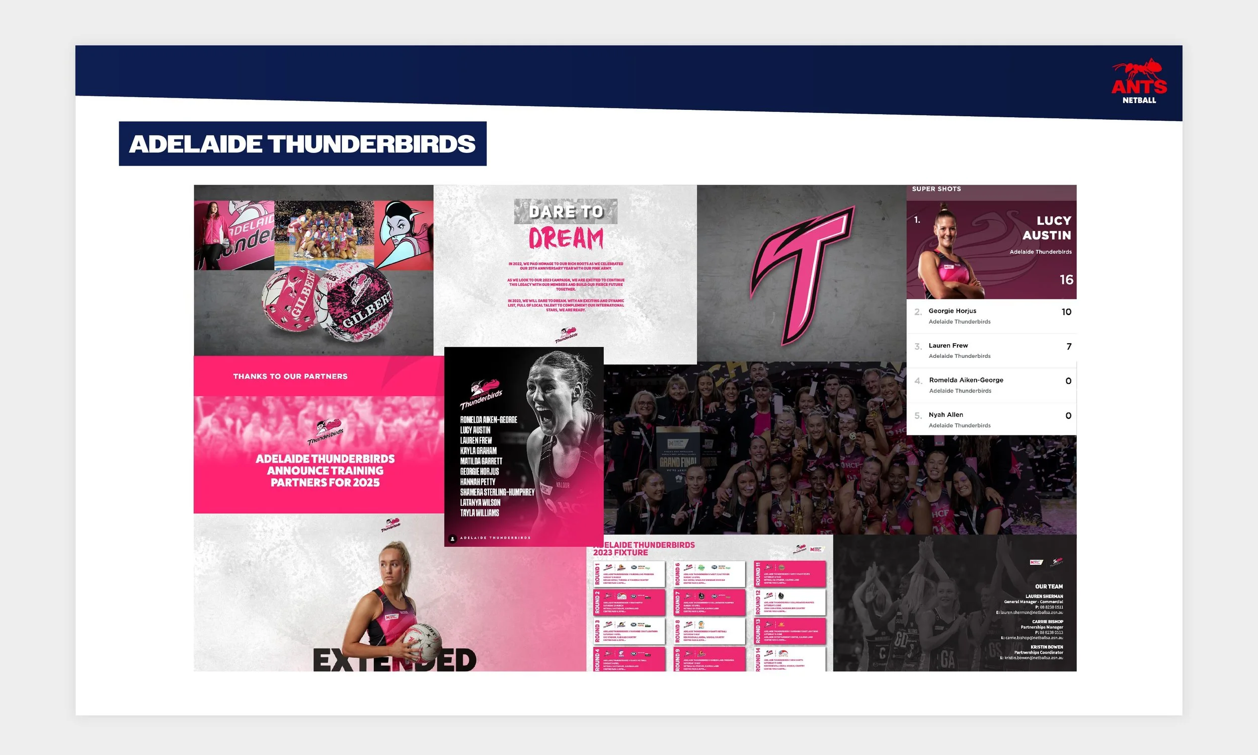
My approach was to visually assess whether my club's branding was up to date or not, I did this by conducting research on the rival clubs from the world’s best netball leagues. The two best leagues in this regard are the Australian Suncorp Super League and the UK's Netball Super League 2.0.
I decided to compare the two against one another, to see how they differ, and then look at the key takeaways. I then used these to assess my clubs branding and how it could be improved upon.

Netball Super League 2.0 - key takeaways:
Simple silhouette logo design
A portion of the logos use a stroke
2 - 4 primary colour usage
Large usage of text and vectors
Gradients, lock-ups and patterns used to create dynamic movement
Suncorp Super League - key takeaways:
Simple solid filled logo design
Strokes on the logos are not prefered
Heavily photography based
3 primary colour usage
Gradients, lock-ups and patterns used to create dynamic movement
ANTS NETBALL ANALYSIS
Upon review, it became evident that our visual identity was not only outdated in several areas, but our overall brand lacked cohesion. The absence of brand guidelines has led to a disconnect between the various materials we have and the design of our dresses and kit. This inconsistency has led to the need for a unified approach to our visual representation, ensuring that every element aligns seamlessly and reflects the true essence of our club.
To address these challenges, I will recreate the brand again from the ground up, the aim to make everything more streamline. This will be displayed in a set of comprehensive brand guidelines that outline a cohesive visual identity for the club. These guidelines will encompass all design elements, from the colours and fonts to the layout and imagery. By ensuring consistency across all materials, we will align the design of our dresses and kit with our overall brand identity. This unified approach will not only enhance our visual appeal but also strengthen our brand's recognition and impact, both within the club and in the wider community.

THE REBRand
The purpose of the rebrand is to refresh and reposition the club within the netball community alongside the rise of the new UK Superleague 2.0. This initiative was driven by various factors, such as the need to stay relevant in our growing sport, the desire to reach new audiences, and the goal of better reflecting the values of our club. The aim is to enhance our club's already highly regarded local reputation and to create a stronger connection with our online audiences. This rebrand signifies a commitment to growth and adaptability.
To ensure the rebrand is implemented consistently and effectively, thereby enhancing the overall impact and longevity of the club's image, it was crucial to create a set of brand guidelines. These guidelines serve as a blueprint for how the brand should be represented, outlining standards for design elements such as logo usage, colour palette, typography, imagery, video, and more. I have applied this knowledge to the ANTS NETBALL Brand Guidelines document below.
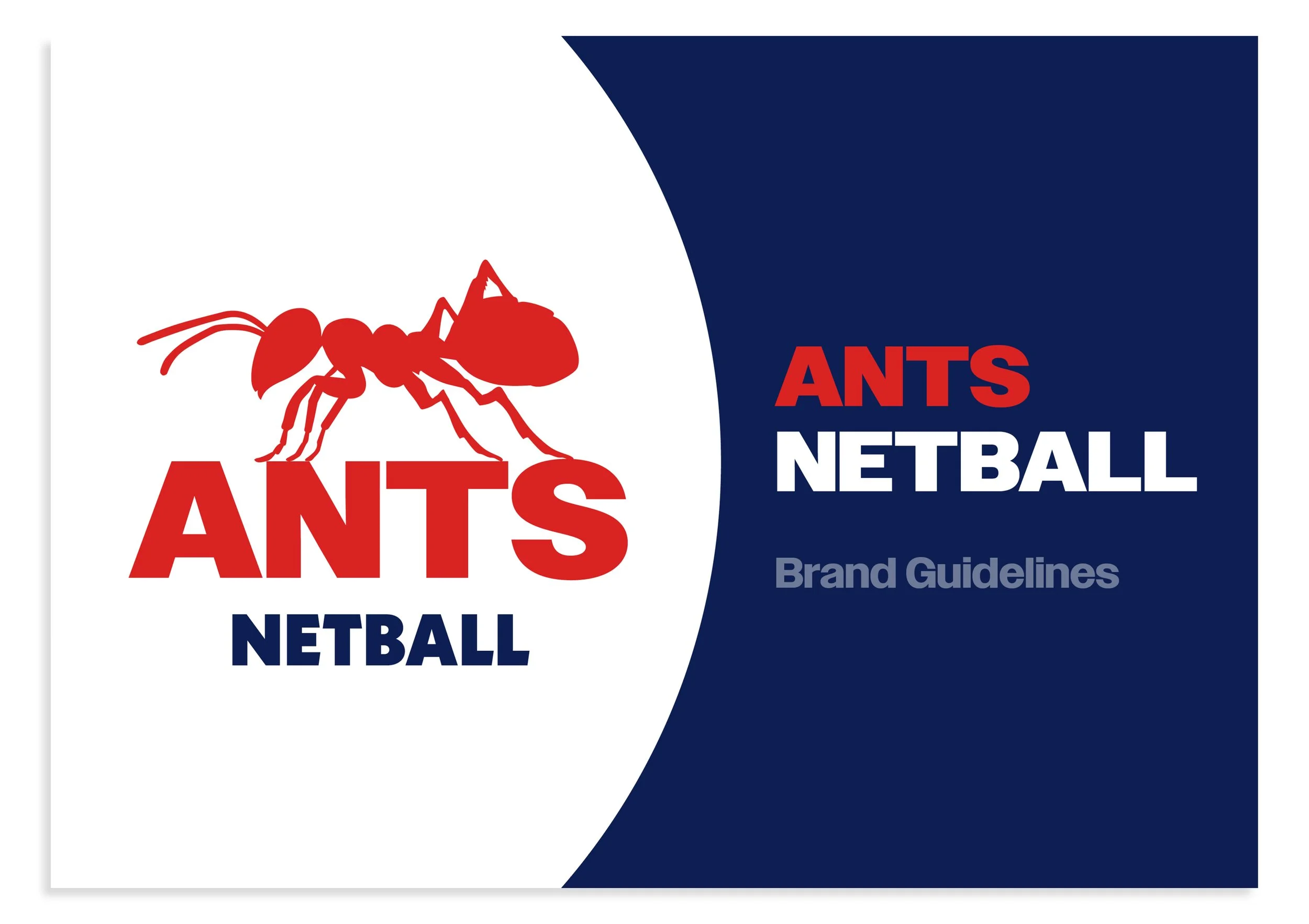
Click the Cover Image above to view the ANTS NETBALL Brand Guidelines
Animated artwork
Video or motion graphics elevates a design from just being static, to being able to tell a story or give a message with movement. This can captivate audiences attention sometimes far more effectively than static content, which is why as a club the aim is to post up to three times a week. This predominantly being in short-form formats, because the standard online, is short engaging content for social media.
An exception to this rule is YouTube, where content can have a significantly longer runtime. This platform allows us to host comprehensive footage of our training sessions, which can extend up to 90 minutes. By providing extended content on YouTube, we offer a deeper insight into our training routines and techniques, allowing our audience to fully immerse themselves.
ANTS NETBALL Logo - White on navy background
ANTS NETBALL Logo - Navy on white background
ANTS NETBALL Youtube Training session - Usage example on club footage
Social Artwork
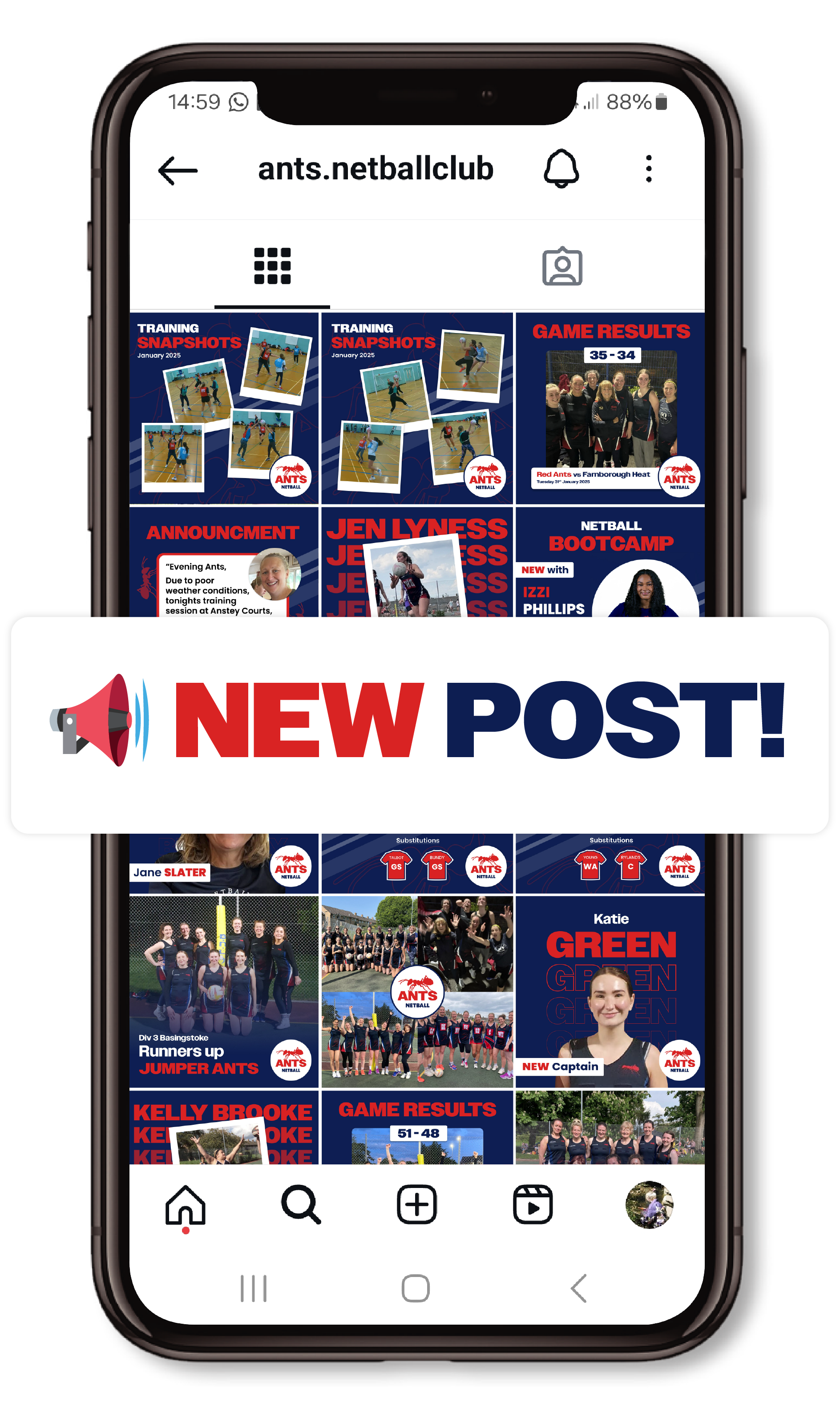
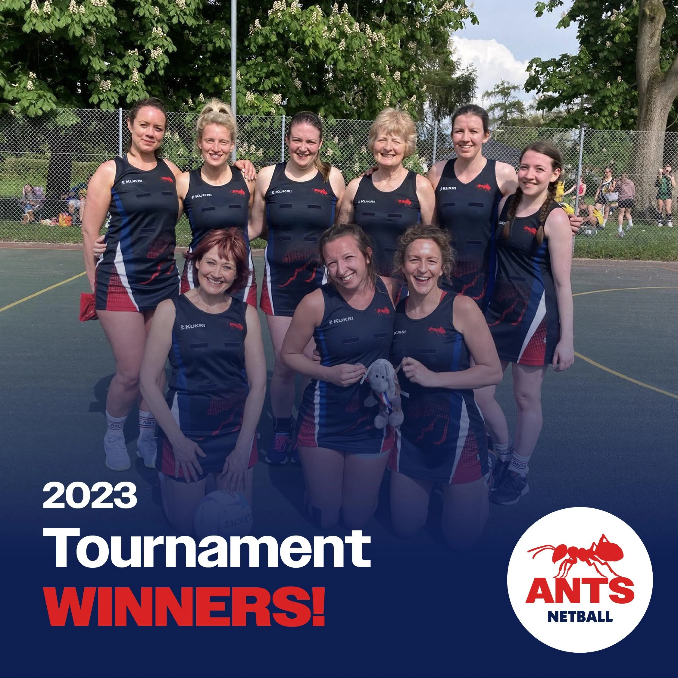
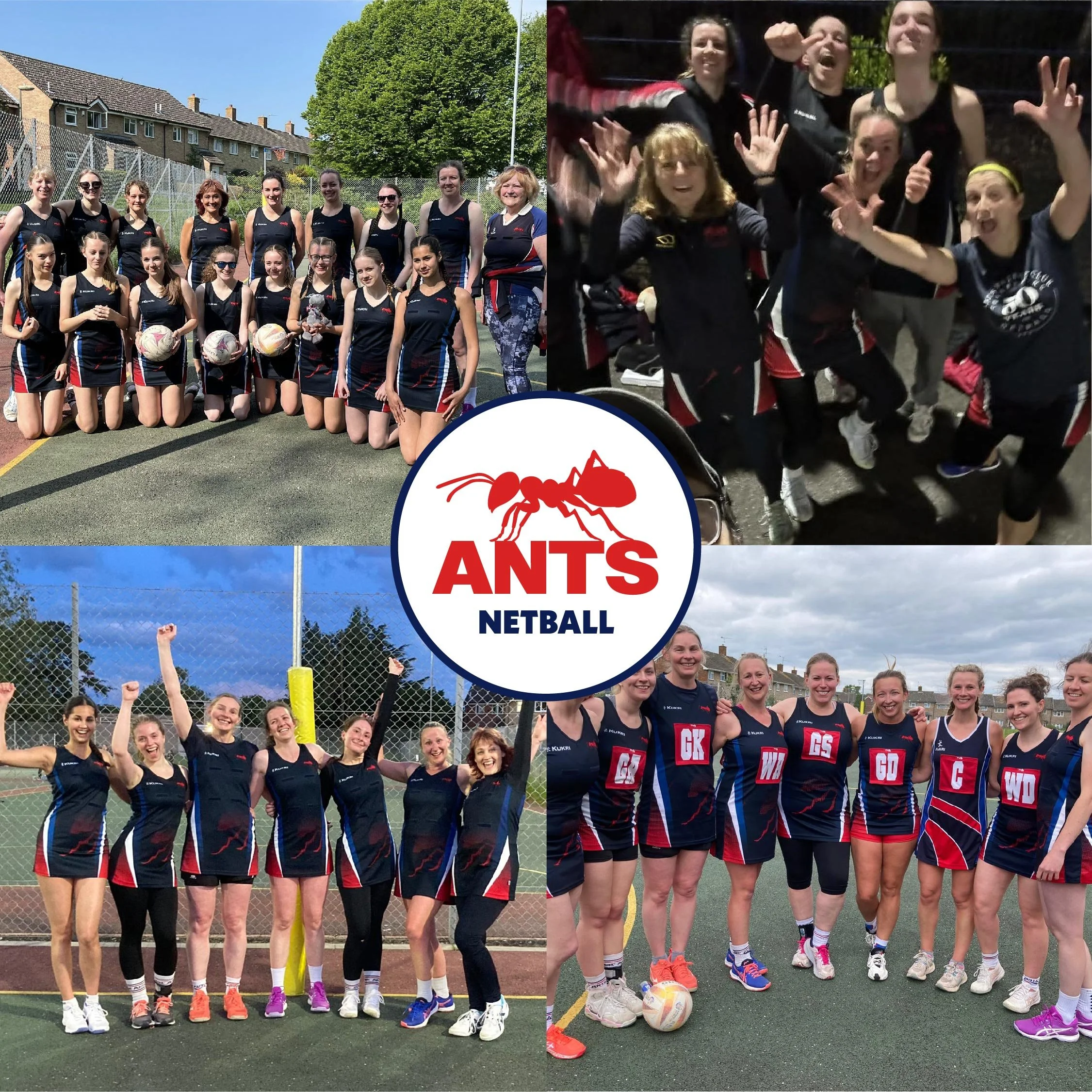
The club and its players are constantly striving for success and progress. Their netballing achievements are a source of immense pride, and they eagerly share these accomplishments online via social media channels to celebrate their hard work and dedication.
Unlike rival clubs, both locally and nationally, our club previously lacked a clear visual identifier to link all online social content cohesively. The content was predominantly photography-based, occasionally using a vectorised social post that appeared out of place and failed to create a unified visual presence.
Implementing the new set of brand guidelines ensured that the social media content became more streamlined, giving the impression that it all belongs to the same club rather than appearing as disjointed elements accompanied by photography. All artwork consists of bright, bold photographs or illustrations, featuring simple and minimalist compositions in the ANTS Colour Palette. Our designs reinforce our netball values and community to the general public, establishing a memorable and recognisable brand image.